Charts
Witan supports embedded Excel charts as ordinary OOXML chart parts. The compatibility goal is that supported charts authored in Witan and supported charts authored in Excel are interchangeable and practically indistinguishable: Excel opens Witan-authored charts as normal workbook charts, and Witan can inspect, edit, preserve, and render Excel-authored charts through the same model.
Use the chart APIs when a script needs to inspect or author charts, and use rendering when a script or CI check needs to verify the visible result.
Chart support is best understood in three layers:
| Layer | What it covers |
|---|---|
| Supported chart families | The chart groups Witan models directly: column, bar, line, area, pie, doughnut, scatter, bubble, radar, surface, stock, waterfall, histogram, Pareto, funnel, box and whisker, and Excel-compatible combo charts |
| Public chart model | A stable chart spec for chart names, positions, groups, series, axes, titles, legends, labels, markers, styles, and formatting |
| OOXML interchange and verification | Real Excel chart package parts, Excel-compatible serialization, preservation of additional chart XML during updates, and visual comparison against Excel-rendered baselines |
The public chart spec is not a raw OOXML DOM. It is the stable authoring model for supported chart families. Underneath that model, Witan reads and writes the workbook's actual chart parts rather than converting charts into images, custom metadata, or Witan-only objects.
Supported Chart Families
Witan models and renders the embedded workbook chart families in the support matrix below. “Full support” means the public chart model can author, inspect, preserve, and render the supported Excel family variants. “2-D support” means the common 2-D family is supported, but some 3-D or decorative Excel subtypes are not authorable through the chart model.
Full Support
| Family | OOXML | Status |
|---|---|---|
| Scatter / XY | Classic c:scatterChart |
Marker, smooth, smooth without markers, lines, and lines without markers |
| Radar | Classic c:radarChart |
Standard radar, radar with markers, and filled radar |
| Stock | Classic c:stockChart, plus c:barChart for volume variants |
HLC, OHLC, volume-HLC, and volume-OHLC |
| Waterfall | ChartEx cx:chartSpace, layoutId=waterfall |
Single-series Excel waterfall charts with total columns and connector lines |
| Histogram | ChartEx cx:chartSpace statistical chart |
Numeric and category-bin histograms, including automatic, count, width, underflow, and overflow bin options |
| Pareto | ChartEx cx:chartSpace statistical chart |
Histogram columns, cumulative percentage line, secondary percentage axis, and histogram-equivalent bin options |
| Funnel | ChartEx cx:chartSpace, layoutId=funnel |
Single-series Excel funnel charts with category labels, value labels, legends, and ChartEx axis options supported by Excel |
| Box and whisker | ChartEx cx:chartSpace, layoutId=boxWhisker |
Excel box-and-whisker charts with exclusive/inclusive quartiles, mean markers/lines, inner points, outlier points, and ChartEx axis options supported by Excel |
| Combo | Classic mixed chart groups | Supported classic chart groups in one plot area, including primary and secondary axes and stock-volume combinations |
2-D Support
| Family | OOXML | Supported | Not supported |
|---|---|---|---|
| Column | Classic c:barChart with barDir=col |
Clustered, stacked, and 100% stacked column charts | Cylinder, cone, pyramid, and 3-D column variants |
| Bar | Classic c:barChart with barDir=bar |
Clustered, stacked, and 100% stacked bar charts | Cylinder, cone, pyramid, and 3-D bar variants |
| Line | Classic c:lineChart |
2-D line variants, including stacked, 100% stacked, markers, and smooth lines | 3-D line authoring; loaded 3-D line charts are rendered as 2-D line charts |
| Area | Classic c:areaChart |
2-D area, stacked area, and 100% stacked area charts | 3-D area authoring; loaded 3-D area charts are rendered as 2-D area charts |
| Pie | Classic c:pieChart |
Standard pie charts | Exploded pie, pie-of-pie, bar-of-pie, and 3-D pie authoring |
| Doughnut | Classic c:doughnutChart |
Standard doughnut charts | Exploded doughnut |
| Bubble | Classic c:bubbleChart |
2-D bubble charts | 3-D bubble-effect authoring |
| Surface | Classic c:surfaceChart |
Top-view filled contour and top-view wireframe contour charts | 3-D surface and 3-D wireframe surface variants |
Not Supported
| Family | OOXML |
|---|---|
| Treemap | ChartEx |
| Sunburst | ChartEx |
| Map / RegionMap | ChartEx |
Representative Renders
The examples below are rendered by Witan from chart fixtures and cropped to the chart object anchor, so the images show the chart bounds rather than surrounding worksheet rows or columns.
| Family | Witan render | Example coverage |
|---|---|---|
| Column |
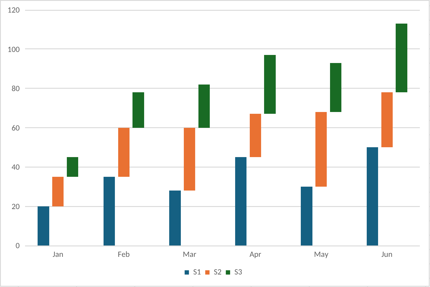
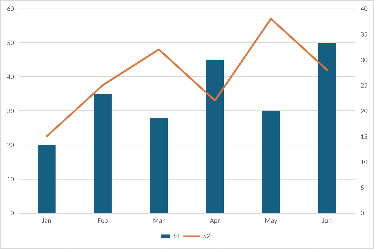
|
Stacked columns, multiple series, legend, gridlines, and value axis |
| Bar |
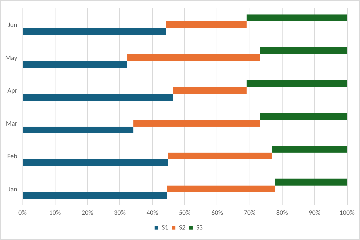
|
100% stacked horizontal bars, category axis, value axis, and legend |
| Line |
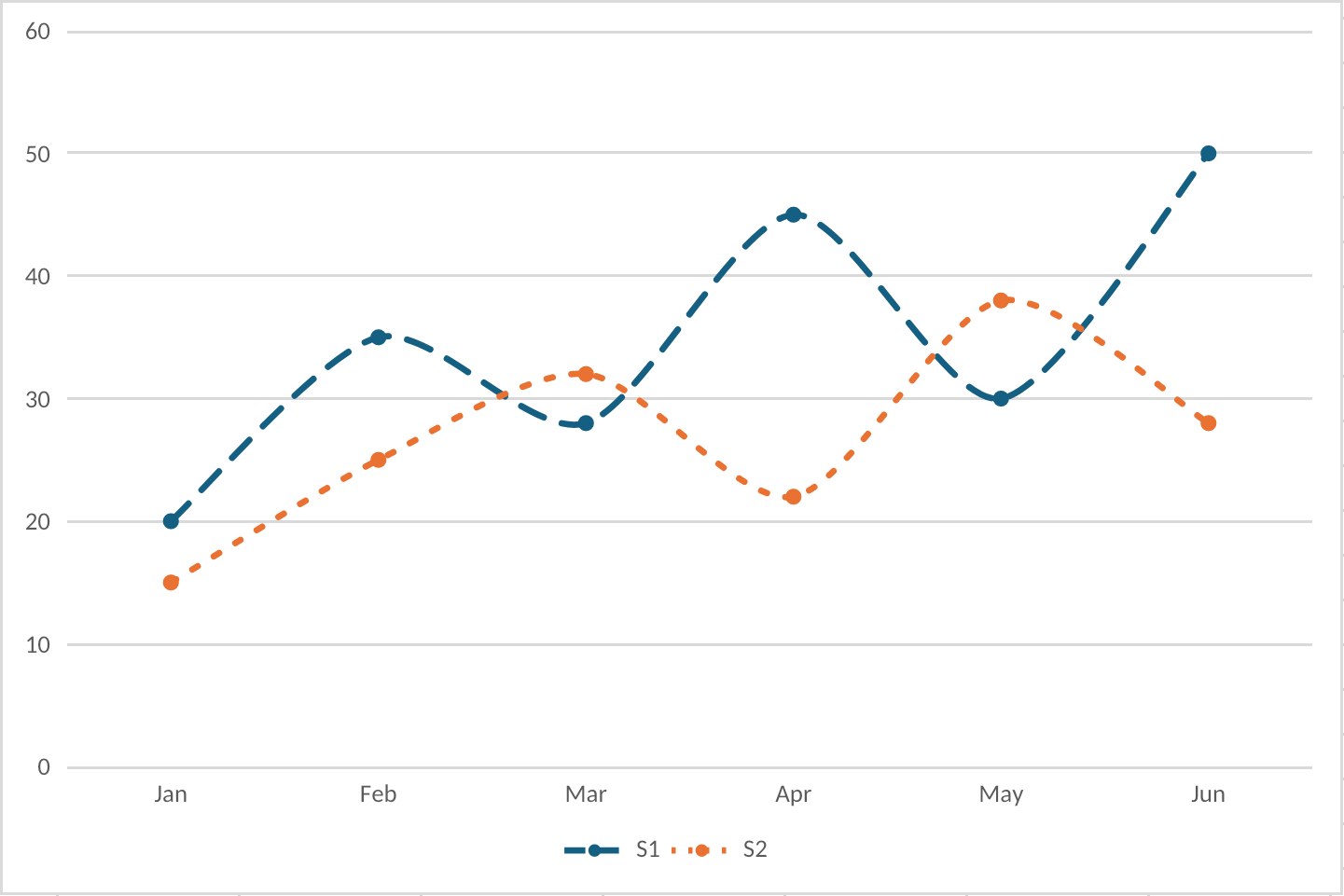
|
Smooth line series, markers, dashed styling, gridlines, and legend |
| Area |
|
Area fills, multiple series, styled drop lines, gridlines, and legend |
| Pie |
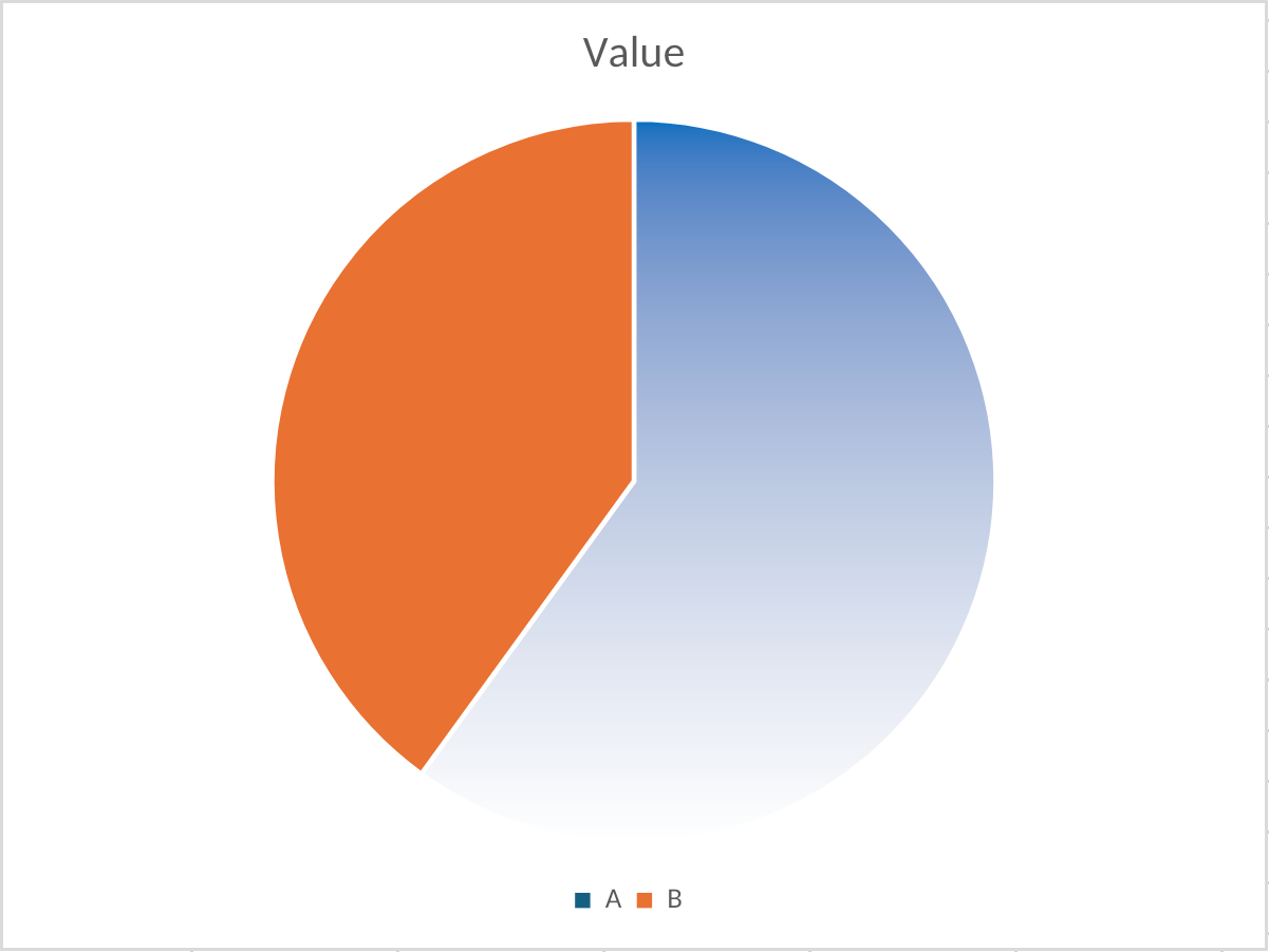
|
Slice geometry, theme colors, custom slice fill, and legend |
| Doughnut |
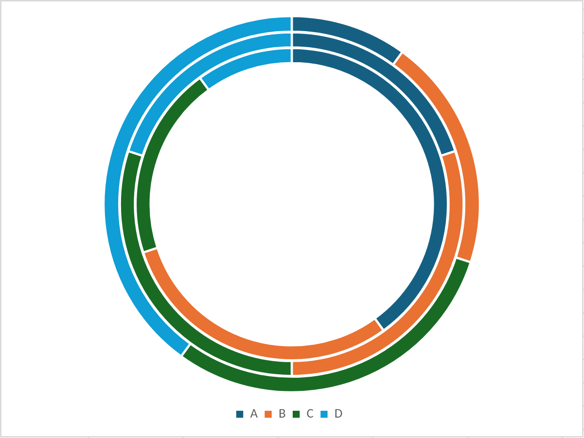
|
Multi-series rings, hole sizing, slice colors, and legend |
| Scatter / XY |
|
XY plotting, markers, axes, gridlines, legend, and trendline rendering |
| Bubble |
|
X/Y values, bubble-size values, variable marker areas, labels, axes, and legend |
| Radar |
|
Filled radar polygons, series order, radial gridlines, labels, and legend |
| Surface |
|
Top-view contour bands, value-band legend, axes, and gridline styling |
| Stock |
|
Volume columns, OHLC price marks, secondary axis, multi-level categories, and legend |
| Waterfall |
|
Positive/negative steps, total columns, connectors, axes, and gridlines |
| Histogram |
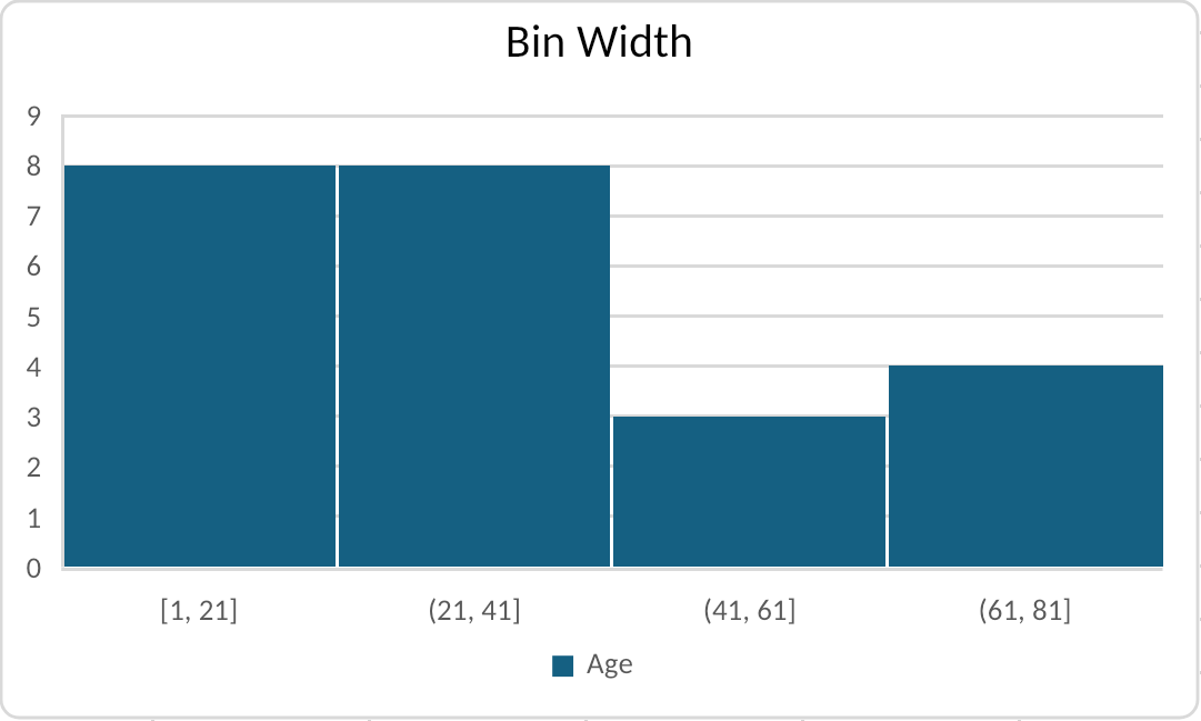
|
Fixed-width bins, bin labels, count axis, gridlines, and ChartEx rendering |
| Pareto |
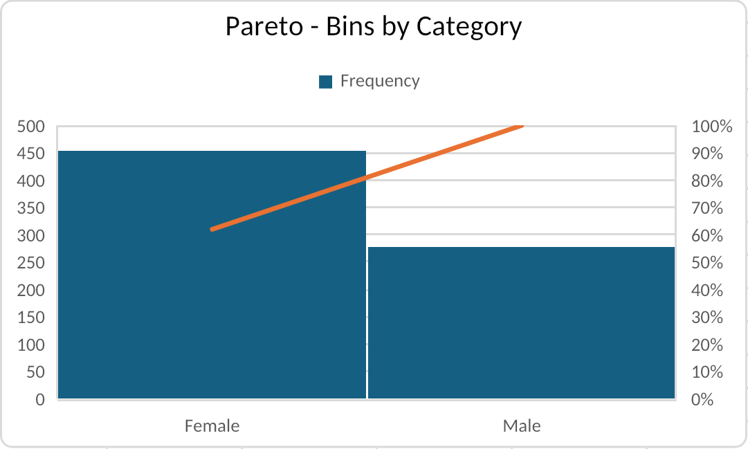
|
Sorted columns, cumulative percentage line, secondary axis, and category bins |
| Funnel |
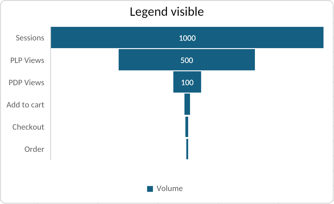
|
Funnel segment geometry, category/value data, labels, and legend placement |
| Box and whisker |
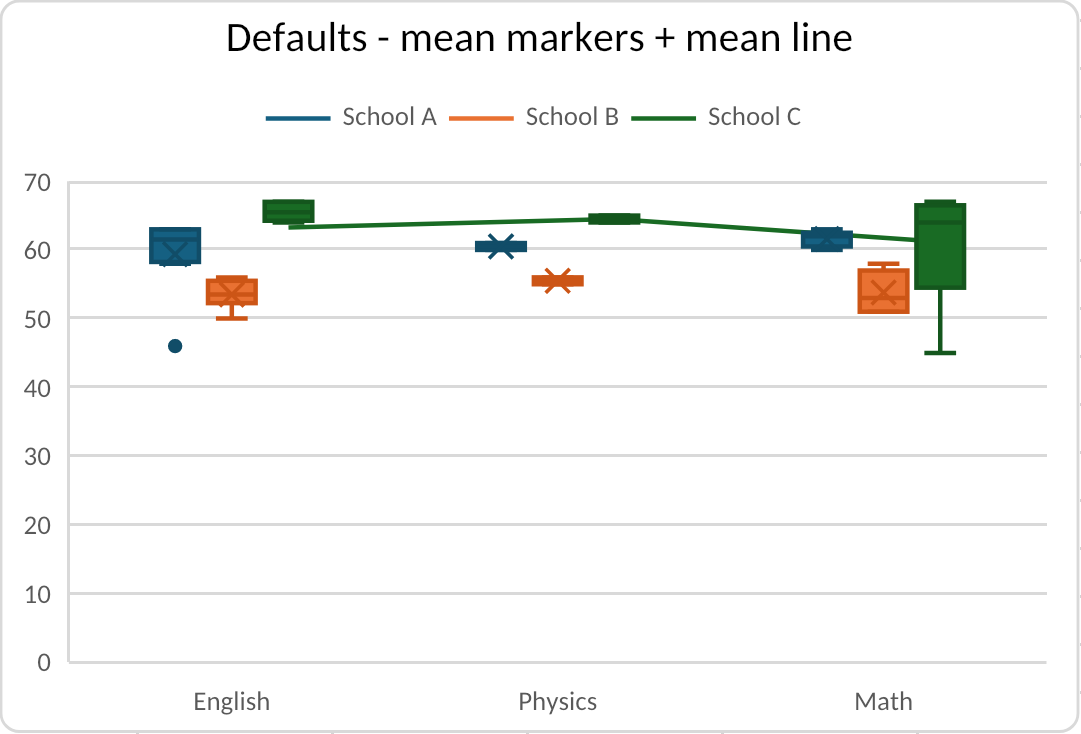
|
Quartiles, whiskers, outliers, mean markers, mean line, axes, and legend |
| Combo |
|
Mixed column and line groups, primary and secondary value axes, gridlines, and legend |
Public Chart Model
Use listCharts to discover charts without reading full chart specs:
witan xlsx exec dashboard.xlsx --expr 'await xlsx.listCharts(wb)'
Each summary includes the chart sheet, name, type, group count, series count, per-group type and axis, and the two-cell position anchor.
Use getChart when a script needs the canonical spec:
witan xlsx exec dashboard.xlsx --expr 'await xlsx.getChart(wb, "Summary", "Revenue")'
A chart spec contains:
position: two cell anchors with optional point offsets.groups: one or more chart groups. Combo charts have multiple groups.series: references for names, categories, values, X values, Y values, and bubble sizes.totalIndexes: zero-based total-column indexes for waterfall series.binOptions: histogram and Pareto binning mode and bin settings.quartileCalculation,showInnerPoints,showMeanLine,showMeanMarker, andshowOutlierPoints: box-and-whisker statistical options.categoriesRefType: category reference kind, including"multiLevelString"for Excel multi-level category labels.radarStyle: radar subtype for radar groups:"standard","marker", or"filled".surfaceVariant: surface subtype for surface groups:"topView"or"topViewWireframe".stockRole: semantic role for stock chart series:volume,open,high,low, orclose.axes: category, value, secondary category, and secondary value axes.titleandlegend: visible text, references, positions, and overlay behavior.dataLabels,marker,styleId,displayBlanksAs, and common chart formatting.
The same shape is used for authoring:
witan xlsx exec dashboard.xlsx --save --stdin <<'WITAN'
await xlsx.addChart(wb, "Summary", {
  name: "Revenue",
  position: { from: { cell: "F2" }, to: { cell: "N18" } },
  groups: [
    {
      type: "column",
      grouping: "standard",
      series: [
        {
          name: { ref: "Summary!B1" },
          categories: "Summary!A2:A9",
          values: "Summary!B2:B9",
          dataLabels: { showValue: true, position: "insideEnd" }
        }
      ]
    }
  ],
  title: { text: "Revenue" },
  legend: { position: "right" },
  axes: {
    category: { title: { text: "Quarter" } },
    value: { title: { text: "Revenue" }, numberFormat: "$#,##0" }
  }
})

await xlsx.previewStyles(wb, "Summary!F2:N18")
WITAN
2-D Cartesian and Combo Charts
Column, bar, line, and area charts share the same category/value series shape. Use grouping for stacked and 100% stacked variants:
await xlsx.addChart(wb, "Summary", {
  name: "Sales and Target",
  position: { from: { cell: "F2" }, to: { cell: "N18" } },
  groups: [
    {
      type: "column",
      grouping: "standard",
      gapWidth: 150,
      series: [
        {
          name: { ref: "Summary!B1" },
          categories: "Summary!A2:A9",
          values: "Summary!B2:B9"
        }
      ]
    },
    {
      type: "line",
      axis: "secondary",
      smooth: true,
      series: [
        {
          name: { ref: "Summary!C1" },
          categories: "Summary!A2:A9",
          values: "Summary!C2:C9",
          marker: { style: "circle", size: 6 }
        }
      ]
    }
  ],
  axes: {
    category: { title: { text: "Quarter" } },
    value: { title: { text: "Sales" }, numberFormat: "$#,##0" },
    secondaryValue: { title: { text: "Target" }, position: "right" }
  }
})
Combo charts are represented as multiple chart groups in one groups array. Each group can bind to the primary or secondary axis with axis: "primary" or axis: "secondary". Witan creates the secondary value axis automatically when a secondary group is present, and you can provide axes.secondaryValue to control its title, number format, bounds, units, gridlines, and position.
For column and bar groups, gapWidth controls spacing between categories and overlap controls spacing between series in the same category. Bar charts are horizontal and use the same public category and value axis names as column charts, even though Excel draws the category axis vertically.
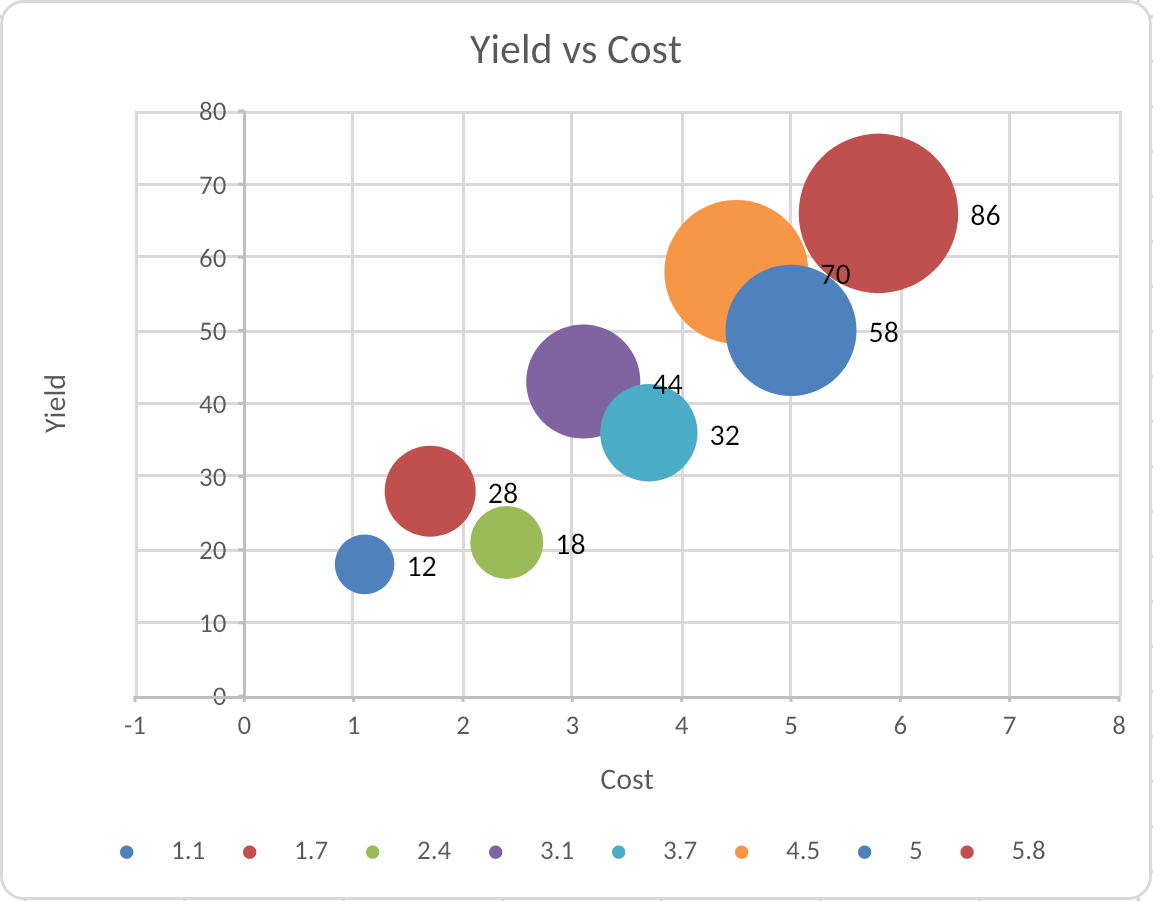
Scatter and Bubble Charts
Scatter and bubble charts use numeric X/Y data rather than category/value data. Use xValues and yValues; for bubble charts, also provide bubbleSizes:
await xlsx.addChart(wb, "Samples", {
  name: "Yield vs Cost",
  position: { from: { cell: "H2" }, to: { cell: "P18" } },
  groups: [
    {
      type: "bubble",
      bubbleScale: 80,
      sizeRepresents: "area",
      series: [
        {
          name: { ref: "Samples!D1" },
          xValues: "Samples!A2:A25",
          yValues: "Samples!B2:B25",
          bubbleSizes: "Samples!C2:C25"
        }
      ]
    }
  ],
  axes: {
    category: { title: { text: "Cost" }, numberFormat: "$#,##0" },
    value: { title: { text: "Yield" }, numberFormat: "0.0%" }
  }
})
For scatter charts, set scatterStyle to "marker", "line", "lineMarker", "smooth", or "smoothMarker". For bubble charts, bubbleScale controls relative bubble size, sizeRepresents can be "area" or "width", and showNegativeBubbles controls whether negative bubble sizes are drawn.
Pie and Doughnut Charts
Pie and doughnut charts use one category/value series and do not use axes:
await xlsx.addChart(wb, "Summary", {
  name: "Revenue Mix",
  position: { from: { cell: "F2" }, to: { cell: "N18" } },
  groups: [
    {
      type: "doughnut",
      holeSize: 55,
      firstSliceAngle: 270,
      varyColors: true,
      series: [
        {
          name: { ref: "Summary!B1" },
          categories: "Summary!A2:A7",
          values: "Summary!B2:B7",
          dataLabels: { showCategory: true, showPercent: true, position: "bestFit" }
        }
      ]
    }
  ],
  legend: { position: "right" }
})
Use type: "pie" for a standard pie chart and type: "doughnut" for a doughnut chart. firstSliceAngle rotates the chart, holeSize applies to doughnut charts, and varyColors gives each slice a different theme color. Percent labels are calculated by Excel and rendered from the chart data.
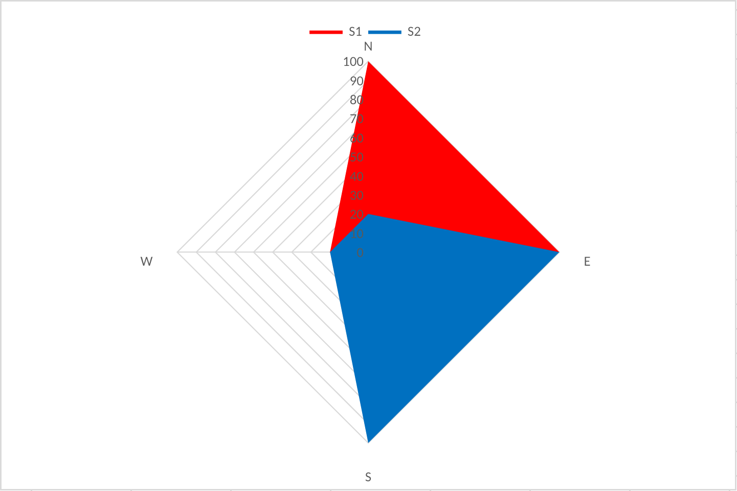
Radar Charts
Radar charts use one chart group with type: "radar". Set radarStyle to choose the Excel radar variant:
"standard": line radar without visible point markers."marker": line radar with visible point markers."filled": filled radar polygons.
await xlsx.addChart(wb, "Summary", {
  name: "Capability Radar",
  position: { from: { cell: "F2" }, to: { cell: "N18" } },
  groups: [
    {
      type: "radar",
      radarStyle: "marker",
      series: [
        {
          name: { ref: "Summary!B1" },
          categories: "Summary!A2:A7",
          values: "Summary!B2:B7"
        },
        {
          name: { ref: "Summary!C1" },
          categories: "Summary!A2:A7",
          values: "Summary!C2:C7"
        }
      ]
    }
  ],
  title: { text: "Capability Radar" },
  legend: { position: "top" },
  axes: {
    category: { visible: true },
    value: { min: 0, max: 100, majorUnit: 20, majorGridlines: true }
  },
  styleId: 317
})
Excel stores both standard radar and radar-with-markers as c:radarChart with radarStyle="marker"; Witan exposes them as the public radarStyle values above and handles the marker defaults needed for Excel-compatible serialization. Filled radar uses radarStyle: "filled" and is rendered in Excel series z-order, with later filled series painted over earlier ones.
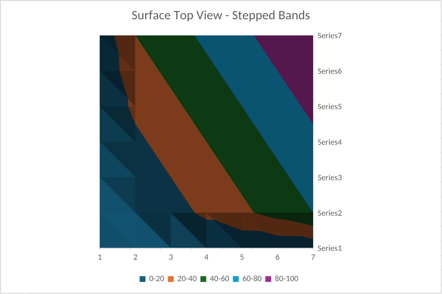
Surface Charts
Surface charts use classic c:surfaceChart parts for Excel's two top-view 2-D contour variants. Set surfaceVariant to choose the variant:
"topView": filled contour surface chart."topViewWireframe": wireframe contour surface chart.
Surface series use value ranges only. Do not provide categories, markers, data labels, secondary axes, or combo groups for surface charts.
await xlsx.addChart(wb, "Summary", {
  name: "Response Surface",
  position: { from: { cell: "F2" }, to: { cell: "N18" } },
  groups: [
    {
      type: "surface",
      surfaceVariant: "topViewWireframe",
      series: [
        { values: "Summary!B2:G2" },
        { values: "Summary!B3:G3" },
        { values: "Summary!B4:G4" },
        { values: "Summary!B5:G5" },
        { values: "Summary!B6:G6" },
        { values: "Summary!B7:G7" }
      ]
    }
  ],
  title: { text: "Response Surface" },
  legend: { position: "right" },
  axes: {
    value: { min: 0, max: 100, majorUnit: 20, numberFormat: "0" }
  },
  styleId: 2
})
The surface legend represents value bands rather than series names. Wireframe legends use outline-only band swatches, matching Excel's contour legend.
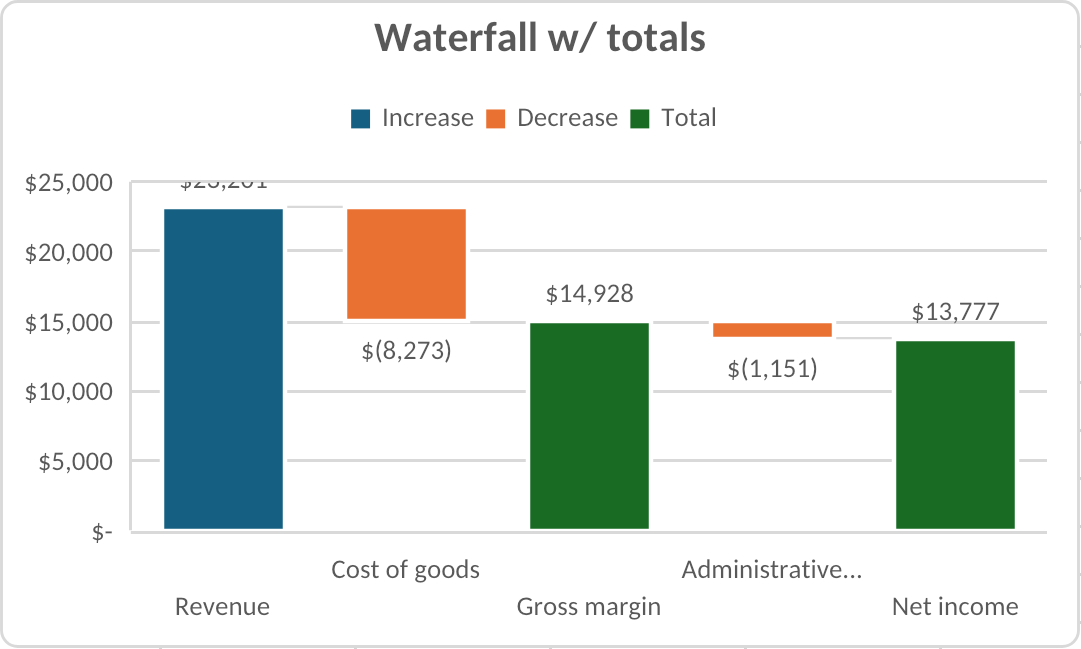
Waterfall Charts
Waterfall charts use Excel's modern ChartEx chart parts. They are authorable, inspectable, renderable, and saved as ordinary Excel waterfall charts.
Waterfall authoring supports one waterfall group with one series. Mark subtotal or total bars with zero-based totalIndexes:
await xlsx.addChart(wb, "Summary", {
  name: "Profit Bridge",
  position: { from: { cell: "F2" }, to: { cell: "N18" } },
  groups: [
    {
      type: "waterfall",
      series: [
        {
          name: { ref: "Summary!B1" },
          categories: "Summary!A2:A9",
          values: "Summary!B2:B9",
          totalIndexes: [3, 7]
        }
      ]
    }
  ],
  title: { text: "Profit Bridge" },
  legend: { position: "topRight" },
  axes: {
    category: {
      title: { text: "Step" },
      numberFormat: "@",
      numberFormatLinked: false
    },
    value: {
      title: { text: "USD" },
      min: 0,
      majorUnit: 25000,
      numberFormat: "$#,##0",
      numberFormatLinked: false,
      majorGridlines: true
    }
  },
  styleId: 395
})
Waterfall axes support the same features accepted by Excel:
- Category axis: literal text title, visibility, number format/linking, major and minor gridlines.
- Value axis: literal text title, visibility, min/max bounds, major/minor units, number format/linking, major and minor gridlines.
Histogram and Pareto Charts
Histogram and Pareto charts use Excel's modern ChartEx chart parts. They are authorable, inspectable, renderable, and saved as ordinary Excel statistical charts.
Use one chart group with type: "histogram" or type: "pareto", and one series. Numeric histograms use values; category-bin histograms use both categories and values.
await xlsx.addChart(wb, "Summary", {
  name: "Age Distribution",
  position: { from: { cell: "F2" }, to: { cell: "N18" } },
  groups: [
    {
      type: "histogram",
      series: [
        {
          name: { text: "Ages" },
          values: "Summary!B2:B101",
          binOptions: {
            type: "binWidth",
            width: 5,
            allowUnderflow: true,
            underflowValue: 18,
            allowOverflow: true,
            overflowValue: 80
          }
        }
      ]
    }
  ],
  title: { text: "Age Distribution" },
  axes: {
    category: { title: { text: "Age bin" } },
    value: { title: { text: "Count" }, majorGridlines: true }
  },
  styleId: 366
})
Pareto charts use the same public series shape. Witan writes the histogram columns plus Excel's Pareto cumulative line and secondary percentage axis:
await xlsx.addChart(wb, "Summary", {
  name: "Issue Pareto",
  position: { from: { cell: "F20" }, to: { cell: "N36" } },
  groups: [
    {
      type: "pareto",
      series: [
        {
          name: { text: "Issues" },
          categories: "Summary!A2:A20",
          values: "Summary!B2:B20",
          binOptions: { type: "category" }
        }
      ]
    }
  ],
  title: { text: "Issue Pareto" },
  axes: {
    value: { title: { text: "Count" }, majorGridlines: true },
    secondaryValue: {
      min: 0,
      max: 1,
      numberFormat: "0%",
      numberFormatLinked: false,
      position: "right"
    }
  }
})
Supported binOptions modes are:
| Mode | Required fields | Source shape |
|---|---|---|
"auto" |
none | Numeric values; Witan uses Excel-compatible automatic bin width behavior for rendering |
"binCount" |
count |
Numeric values; divides the numeric span into the requested number of bins |
"binWidth" |
width |
Numeric values; uses fixed-width bins |
"category" |
none | categories plus values; groups equal category labels and sums their values |
For numeric modes, allowUnderflow with underflowValue adds a <= value bin, and allowOverflow with overflowValue adds a > value bin. Category-bin mode does not accept numeric bin count, width, underflow, or overflow settings. Pareto charts sort bins by descending count or value before drawing the cumulative percentage line.
Box and Whisker Charts
Box-and-whisker charts use Excel's modern ChartEx chart parts. They are authorable, inspectable, renderable, and saved as ordinary Excel box-and-whisker charts.
Use one chart group with type: "boxWhisker". Each series supplies the observations for one distribution across the category buckets. Use quartileCalculation to choose Excel's quartile method:
"exclusive": Excel's default exclusive-median quartiles."inclusive": Excel's inclusive-median quartiles.
await xlsx.addChart(wb, "Scores", {
  name: "Exam Distribution",
  position: { from: { cell: "F2" }, to: { cell: "N18" } },
  groups: [
    {
      type: "boxWhisker",
      series: [
        {
          name: { ref: "Scores!B1" },
          categories: "Scores!A2:A41",
          values: "Scores!B2:B41",
          quartileCalculation: "inclusive",
          showMeanMarker: true,
          showMeanLine: false,
          showInnerPoints: false,
          showOutlierPoints: true
        },
        {
          name: { ref: "Scores!C1" },
          categories: "Scores!A2:A41",
          values: "Scores!C2:C41"
        }
      ]
    }
  ],
  title: { text: "Exam Distribution" },
  legend: { position: "top" },
  axes: {
    category: { title: { text: "Subject" } },
    value: { title: { text: "Score" }, min: 0, max: 100, majorGridlines: true }
  },
  styleId: 406
})
Supported box-and-whisker series options are:
| Field | Behavior |
|---|---|
quartileCalculation |
"exclusive" or "inclusive"; defaults to "exclusive" |
showInnerPoints |
Draws non-outlier source points inside the whisker range |
showMeanLine |
Connects mean markers across categories in the same series |
showMeanMarker |
Draws the mean marker; defaults to visible |
showOutlierPoints |
Draws outlier points when Excel would display them; defaults to visible |
Whiskers use Excel's 1.5×IQR fence calculation. Very small buckets can have values outside the fences that still participate in axis scaling even when no outlier marker is drawn; Witan keeps those values in the statistical model for Excel-compatible scaling while suppressing marker drawing separately.
Office Script uses Excel's enum spelling, so sheet.addChart(ExcelScript.ChartType.boxwhisker, range, ...) maps to the public chart type boxWhisker. One-column and one-row box-and-whisker source ranges infer a text header as the series name and use the remaining cells as values.
Funnel Charts
Funnel charts use Excel's modern ChartEx chart parts. They are authorable, inspectable, renderable, and saved as ordinary Excel funnel charts.
Use one chart group with type: "funnel" and one category/value series. Funnel charts preserve source order; Witan does not sort stages by value.
await xlsx.addChart(wb, "Summary", {
  name: "Pipeline",
  position: { from: { cell: "F2" }, to: { cell: "N18" } },
  groups: [
    {
      type: "funnel",
      series: [
        {
          name: { ref: "Summary!B1" },
          categories: "Summary!A2:A7",
          values: "Summary!B2:B7",
          dataLabels: { showValue: true, position: "center" }
        }
      ]
    }
  ],
  title: { text: "Pipeline" },
  legend: { position: "bottom" },
  axes: {
    category: {
      title: { text: "Stage" },
      numberFormat: "@",
      numberFormatLinked: false
    }
  },
  styleId: 419
})
Funnel source data is a single category/value shape:
| Source shape | Behavior |
|---|---|
categories plus values |
Uses the category labels and value magnitudes directly |
values only |
Draws the values and lets Excel use default point categories |
Office Script ChartCollection.add(Excel.ChartType.funnel, range, Excel.ChartSeriesBy.columns) with one column |
Treats the column as values, with an optional header row for the series name |
Office Script ChartCollection.add(Excel.ChartType.funnel, range, Excel.ChartSeriesBy.columns) with two columns |
Treats the first column as categories and the second as values, with the value-column header as the series name |
Office Script row-oriented funnel sources are rejected because Excel-authored ChartEx row formulas collapse to a single point rather than the expected multi-stage funnel. Funnel charts do not use a value axis, secondary axes, combo groups, markers, smoothing, bubble sizes, bin options, or waterfall total/connector settings. Non-positive, blank, text, and error values keep their category position but do not draw a visible funnel segment.
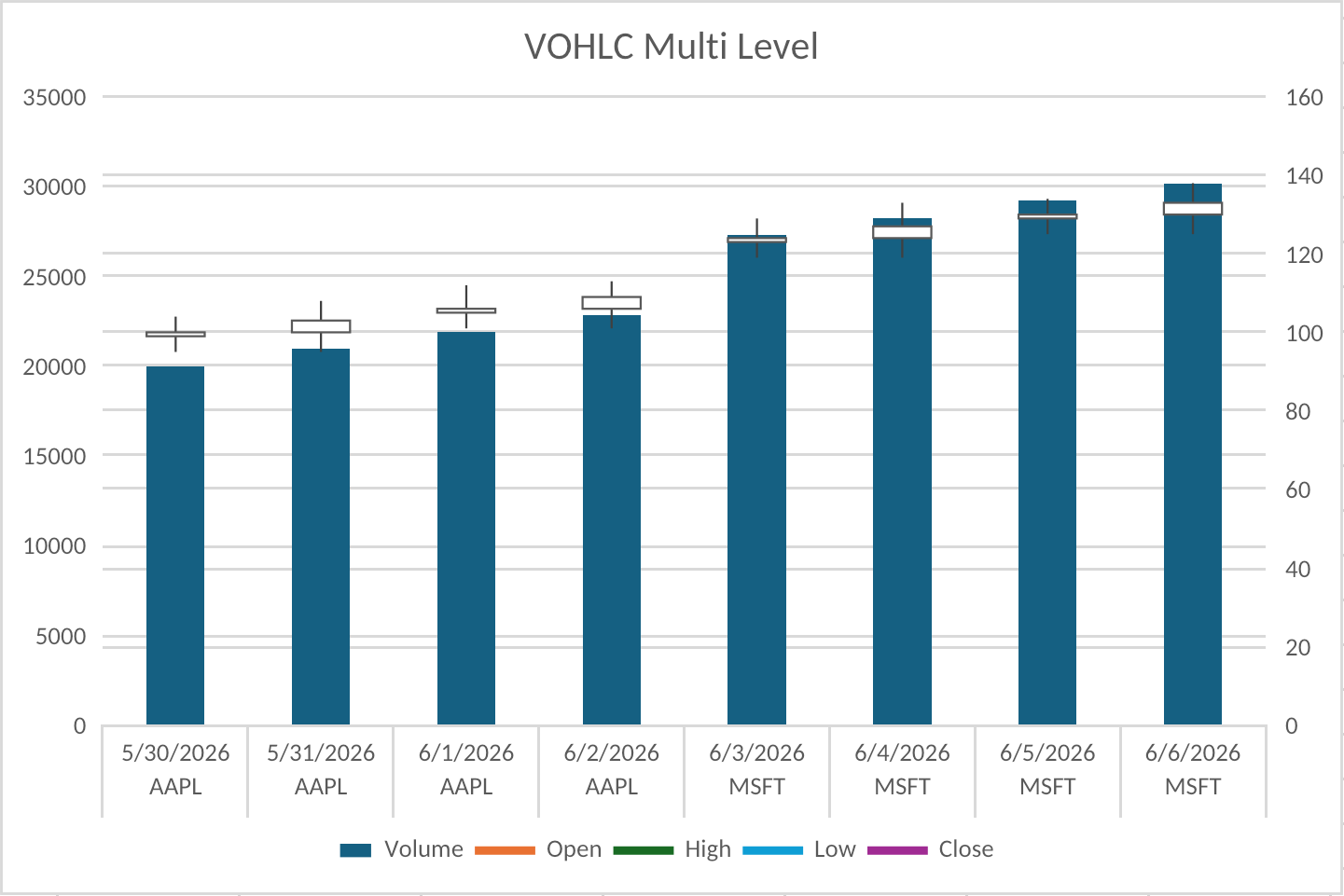
Stock Charts
Stock price groups use first-class chart types: stockHLC and stockOHLC. Stock series are positional and follow Excel's UI order:
- HLC:
high,low,close - OHLC:
open,high,low,close
For an OHLC chart:
await xlsx.addChart(wb, "Prices", {
  name: "OHLC",
  position: { from: { cell: "H2" }, to: { cell: "N18" } },
  groups: [
    {
      type: "stockOHLC",
      series: [
        { stockRole: "open", name: { ref: "Prices!B1" }, categories: "Prices!A2:A30", values: "Prices!B2:B30" },
        { stockRole: "high", name: { ref: "Prices!C1" }, categories: "Prices!A2:A30", values: "Prices!C2:C30" },
        { stockRole: "low", name: { ref: "Prices!D1" }, categories: "Prices!A2:A30", values: "Prices!D2:D30" },
        { stockRole: "close", name: { ref: "Prices!E1" }, categories: "Prices!A2:A30", values: "Prices!E2:E30" }
      ]
    }
  ],
  title: { text: "OHLC" },
  legend: { position: "bottom" }
})
Volume stock charts are combo charts. Put a primary-axis column group with stockRole: "volume" before a secondary-axis stockHLC or stockOHLC group:
groups: [
  {
    type: "column",
    axis: "primary",
    series: [
      { stockRole: "volume", name: { ref: "Prices!B1" }, categories: "Prices!A2:A30", values: "Prices!B2:B30" }
    ]
  },
  {
    type: "stockHLC",
    axis: "secondary",
    series: [
      { stockRole: "high", name: { ref: "Prices!C1" }, categories: "Prices!A2:A30", values: "Prices!C2:C30" },
      { stockRole: "low", name: { ref: "Prices!D1" }, categories: "Prices!A2:A30", values: "Prices!D2:D30" },
      { stockRole: "close", name: { ref: "Prices!E1" }, categories: "Prices!A2:A30", values: "Prices!E2:E30" }
    ]
  }
]
Multi-Level Category Labels
Use categoriesRefType: "multiLevelString" when categories points at a rectangular category-label range, such as ticker plus date columns:
{
  type: "column",
  series: [
    {
      name: { ref: "Sheet1!C1" },
      categories: "Sheet1!A2:B9",
      categoriesRefType: "multiLevelString",
      values: "Sheet1!C2:C9"
    }
  ]
}
Witan writes this as Excel c:multiLvlStrRef / c:multiLvlStrCache and renders the repeated label rows and category separators similarly to Excel. Multi-level categories are a general category-axis feature; they are not limited to stock charts.
For full signatures and field types, see xlsx API.
Excel Interchangeability
Charts authored by Witan are written as normal Excel chart package parts. They open as ordinary editable charts in Excel, with Excel-style chart part locations, relationships, anchors, style parts, color parts, defaults, and chart XML ordering.
For supported chart families, Witan also reads Excel-authored charts back into the public model. A script can call getChart, make a targeted model edit, call setChart, save the workbook, and continue working with the chart in Excel or Witan.
The chart update path rebuilds the modeled chart content and merges it with the existing OOXML chart part. That merge is designed to preserve chart details that are valid Excel chart XML but not necessarily first-class fields in ChartSpec.
Preserved or normalized compatibility details include:
- Chart package topology and drawing anchors.
- Series references and formatted chart data caches.
- Linked number formats for axes, series, and data labels.
- Radar chart subtype semantics, marker defaults, polar axes, fills, and series z-order.
- Waterfall ChartEx parts, including total data points, connector lines, ChartEx legends, and supported ChartEx axis options.
- Histogram and Pareto ChartEx parts, including statistical binning options, category bins, Pareto cumulative-line topology, and secondary percentage axes.
- Funnel ChartEx parts, including category/value source references, legends, labels, and supported ChartEx category-axis options.
- Box-and-whisker ChartEx parts, including quartile calculation, mean marker/line settings, inner/outlier point settings, category/value source references, legends, and supported ChartEx axis options.
- Stock chart topology, including high-low lines, OHLC up/down bars, and volume-stock combo grouping.
- Multi-level category references and caches.
- Modern and legacy chart style/color parts.
- Hidden chart elements such as hidden axes or hidden legends.
- Chart XML for features such as trendlines, error bars, manual layouts, custom title subtrees, and additional shape properties when the modeled edit does not replace that feature.
The result is not a Witan-only artifact. For the supported chart families, the workbook remains a normal Excel workbook with normal Excel charts.
Development Validation
Chart support is developed against Excel behavior, not just against Witan's own data model.
- Authored charts are checked for Excel-compatible package topology, chart relationship paths, style/color part names, drawing anchors, series indexes, and Open XML validation.
- Defaults and serialization are pinned against Excel behavior for bar/column, line, area, pie, doughnut, scatter, bubble, radar, surface, stock, percent-stacked, secondary-axis, and combo cases.
- Witan-authored ChartEx charts, including waterfall, histogram, Pareto, funnel, and box-and-whisker charts, are manually checked through Excel open-save when serialization changes; meaningful chart semantics must survive Excel save.
- Office Script chart behavior is tested against native Excel/Office Script oracle behavior for chart creation, lookup, naming, deletion, positioning, styles, data sources, axes, legends, labels, trendlines, error bars, and formatting surfaces.
- Chart rendering is tested against Excel-captured PNG baselines. The current fixture matrix covers hundreds of cases across area, axis, bar, box-and-whisker, data label, error bar, funnel, histogram, layout, legend, line, linked-format, Pareto, pie, radar, stock, style, surface, title, trendline, and waterfall workbooks, including stock and non-stock multi-level category labels.
Visual Verification
Charts are verified through the renderer. Use previewStyles inside exec when chart verification is part of a larger script:
witan xlsx exec dashboard.xlsx --stdin <<'WITAN'
const charts = await xlsx.listCharts(wb, { sheet: "Summary" })
const chart = charts.find(c => c.name === "Revenue")
if (!chart) throw new Error("Revenue chart not found")

await xlsx.previewStyles(wb, "Summary!F2:N18")
return chart
WITAN
Use the standalone renderer when you need an image file or pixel diff:
witan xlsx render dashboard.xlsx -r "Summary!F2:N18" -o revenue-before.png
# ... edit chart data, formatting, or the chart spec ...
witan xlsx render dashboard.xlsx -r "Summary!F2:N18" --diff revenue-before.png
The chart renderer covers the supported chart families above, plus common titles, axes, axis titles, legends, data labels, gridlines, trendlines, error bars, chart styles, colors, fills, line styles, markers, multi-level category labels, and linked number formats. For ChartEx charts, the renderer handles waterfall axes, totals, connector lines, histogram and Pareto bins, Pareto cumulative percentage lines, funnel segments, box-and-whisker statistics, linked number formats, and Excel-style staggered category labels when labels need additional horizontal space.
Renderer changes are checked by comparing Witan output with Excel-captured baselines and tracking render-gap metrics. This is separate from the chart model round-trip tests: one set checks that the workbook package remains Excel-compatible, and the other checks that the visible output stays close to Excel's raster output.
For general range-rendering behavior, output formats, device pixel ratio, limits, and pixel-diff output, see Witan Render.