Charts
Witan Presentations includes an Excel-style chart API adapted to PowerPoint. This is a Witan extension: upstream Microsoft PowerPoint Office.js does not expose chart authoring APIs.
Charts created through Witan are normal PowerPoint chart shapes with embedded workbook data. They can be opened, edited, and rendered by PowerPoint.
Supported Chart Families
| Family | Office.js value | Notes |
|---|---|---|
| Column | PowerPoint.ChartType.columnClustered, columnStacked, columnStacked100 |
Clustered, stacked, and 100% stacked columns. |
| Bar | barClustered, barStacked, barStacked100 |
Horizontal bar variants. |
| Line | line, lineMarkers, lineStacked, lineStacked100, marker variants |
Smooth lines and markers are available through series properties. |
| Area | area, areaStacked, areaStacked100 |
2-D area variants. |
| Pie and doughnut | pie, doughnut |
Data labels and hole sizing for doughnut charts. |
| Scatter and bubble | xyScatter, scatter line variants, bubble |
Numeric X/Y data; bubble charts use a third size dimension. |
| Radar | radar, radarMarkers, radarFilled |
Standard, marker, and filled radar charts. |
| Surface | surfaceTopView, surfaceTopViewWireframe |
Top-view contour and wireframe surface charts. |
| Stock | stockHLC, stockOHLC, stockVHLC, stockVOHLC |
HLC/OHLC and volume stock variants. |
| Modern ChartEx | waterfall, histogram, pareto, funnel, boxwhisker |
Modern PowerPoint/Excel chart families backed by ChartEx parts. |
| Combo | Per-series chartType and axisGroup changes |
Combine compatible classic chart families in one chart. |
Treemap, sunburst, and map charts are not currently exposed through the Witan chart extension.
Stock Charts
Stock charts support HLC, OHLC, volume-HLC, and volume-OHLC data layouts. Use the corresponding PowerPoint.ChartType.stock* value and provide date/category labels followed by the expected price and volume columns.
Modern Chart Families
Modern ChartEx families include waterfall, histogram, Pareto, funnel, and box-and-whisker charts. They use the same addChart entry point as classic chart families, with type-specific helpers for statistical binning and box-and-whisker display options.
Waterfall Charts
Waterfall charts are useful for positive and negative bridge steps. Connector lines can be controlled through chart.series.getItemAt(0).showConnectorLines.
Box and Whisker Charts
Box-and-whisker charts expose quartile calculation, inner point, outlier point, mean marker, and mean line controls through getBoxwhiskerOptions().
Create a chart
const shape = slide.shapes.addChart(PowerPoint.ChartType.columnClustered, [
  ["Quarter", "Revenue", "Margin"],
  ["Q1", 12, 0.31],
  ["Q2", 18, 0.34],
  ["Q3", 25, 0.39],
  ["Q4", 31, 0.43]
], {
  left: 72,
  top: 96,
  width: 620,
  height: 340,
  name: "Revenue Chart",
  seriesBy: "columns"
});

const chart = shape.getChart();
chart.title.text = "Revenue and Margin";
chart.legend.position = "Bottom";
chart.series.getItemAt(1).chartType = PowerPoint.ChartType.lineMarkers;
chart.series.getItemAt(1).axisGroup = PowerPoint.ChartAxisGroup.secondary;
Replace chart data
Replace embedded workbook data with an array:
chart.setData([
  ["Quarter", "Revenue"],
  ["Q1", 12],
  ["Q2", 18],
  ["Q3", 25]
], { seriesBy: "columns" });
Or point a chart to a local embedded workbook range:
chart.setDataRange("Sheet1!A1:B4", { seriesBy: "columns" });
Axes, labels, and series
chart.axes.valueAxis.title.text = "Revenue";
chart.axes.valueAxis.numberFormat = "$#,##0";
chart.dataLabels.showValue = true;

const series = chart.series.getItemAt(0);
series.name = "Revenue";
series.format.fill.setSolidColor("#2F6FED");
series.format.line.color = "#1D4ED8";
Modern chart options are available through series helpers:
const histogram = chart.series.getItemAt(0).getBinOptions();
histogram.setType(PowerPoint.ChartBinType.binCount);
histogram.setCount(5);

const box = chart.series.getItemAt(0).getBoxwhiskerOptions();
box.setShowMeanMarker(true);
box.setShowOutlierPoints(true);
Representative Renders
These screenshots are rendered by witan pptx render from Witan-authored PowerPoint decks.
| Family | Witan render | Example coverage |
|---|---|---|
| Column |
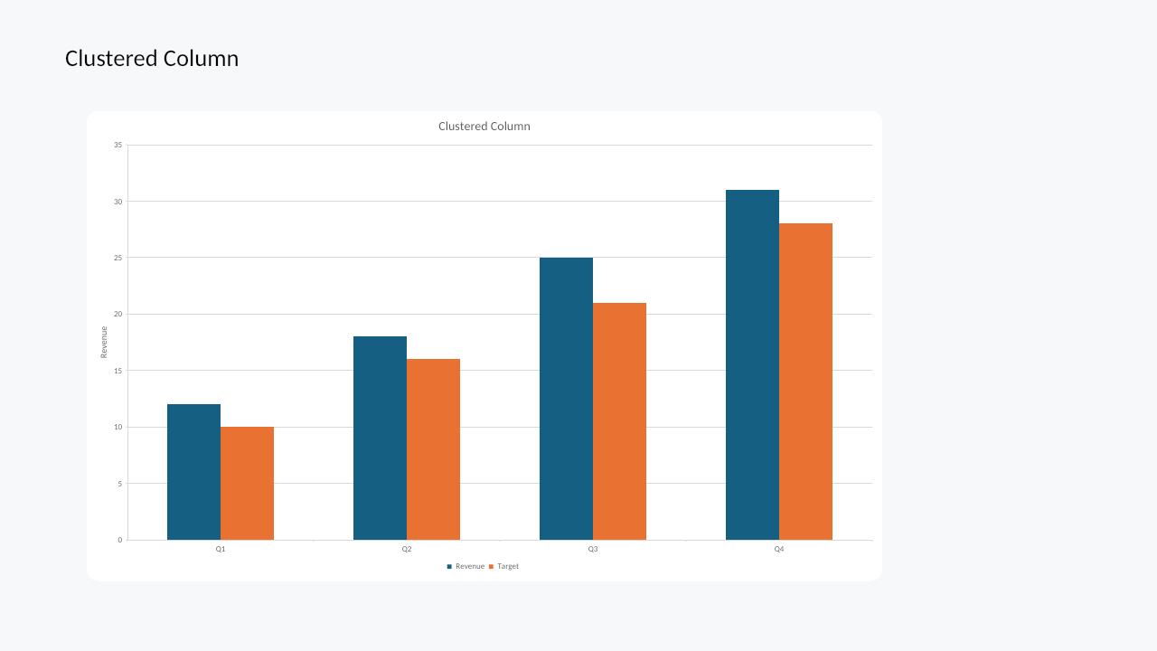
|
Multiple series, title, legend, value axis |
| Bar |
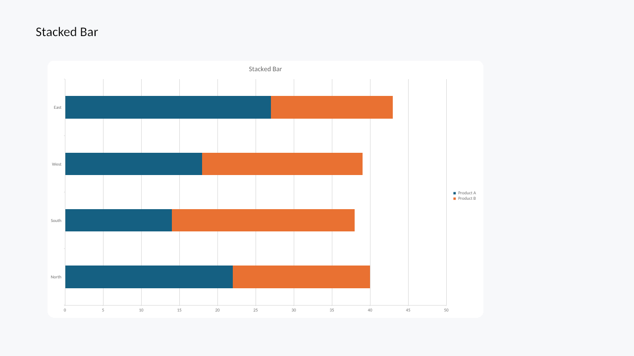
|
Stacked bars, horizontal categories, legend |
| Line |
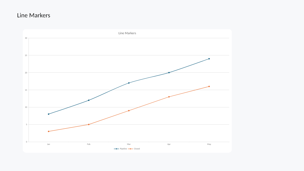
|
Markers, smoothing, multiple series |
| Area |
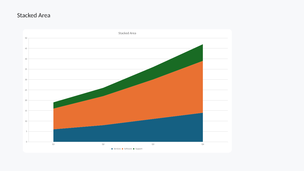
|
Area fills, stacking, legend |
| Pie |
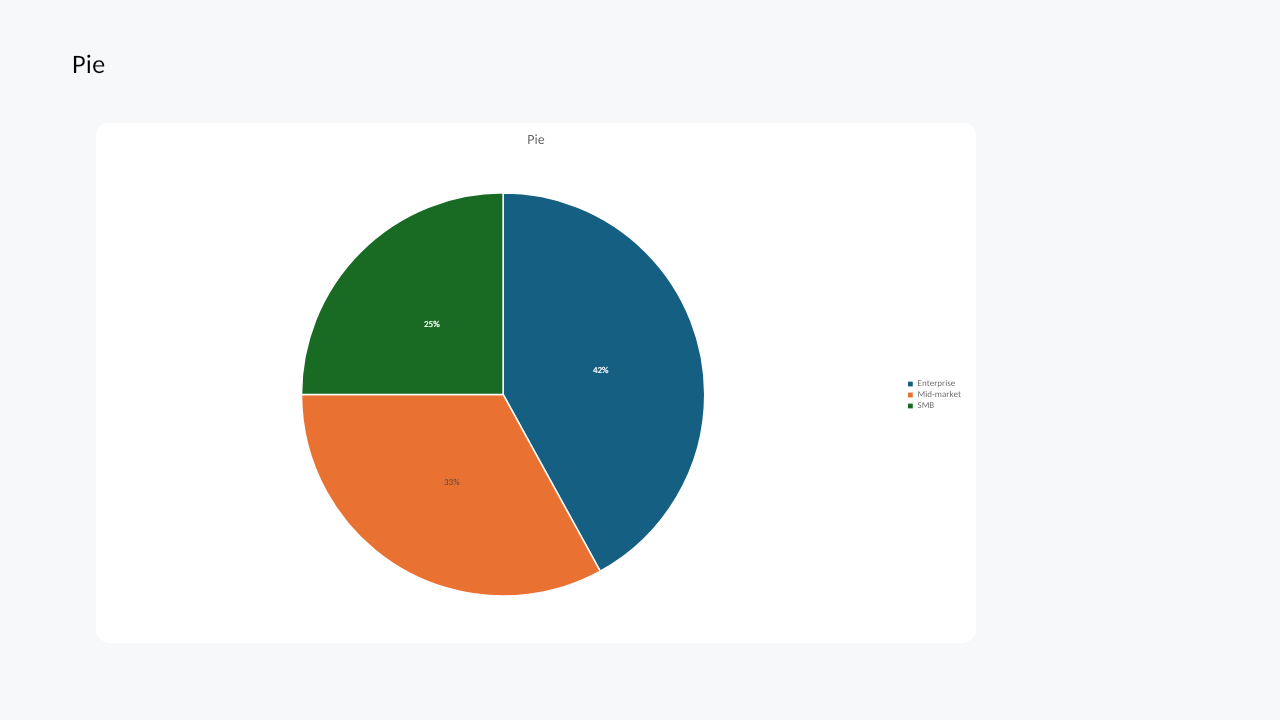
|
Slice geometry, percentage labels |
| Doughnut |
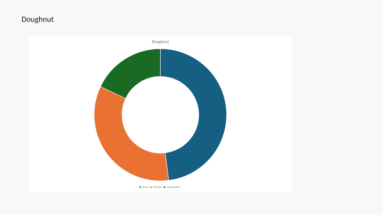
|
Doughnut hole sizing and legend |
| Scatter / XY |
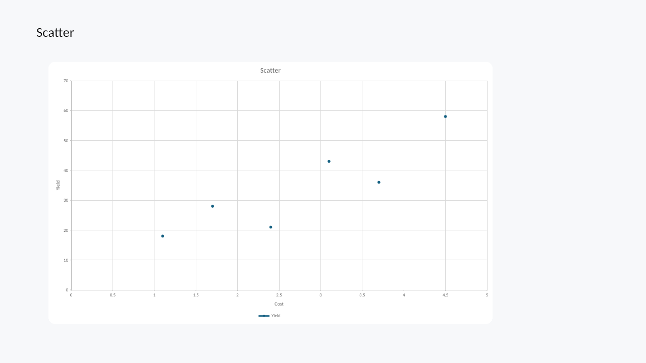
|
Numeric X/Y axes and markers |
| Bubble |
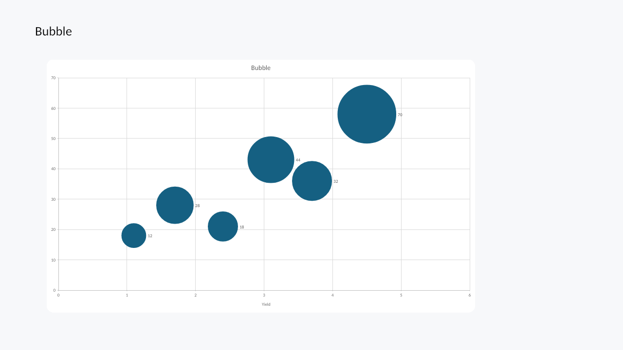
|
X/Y values, bubble sizes, labels |
| Radar |
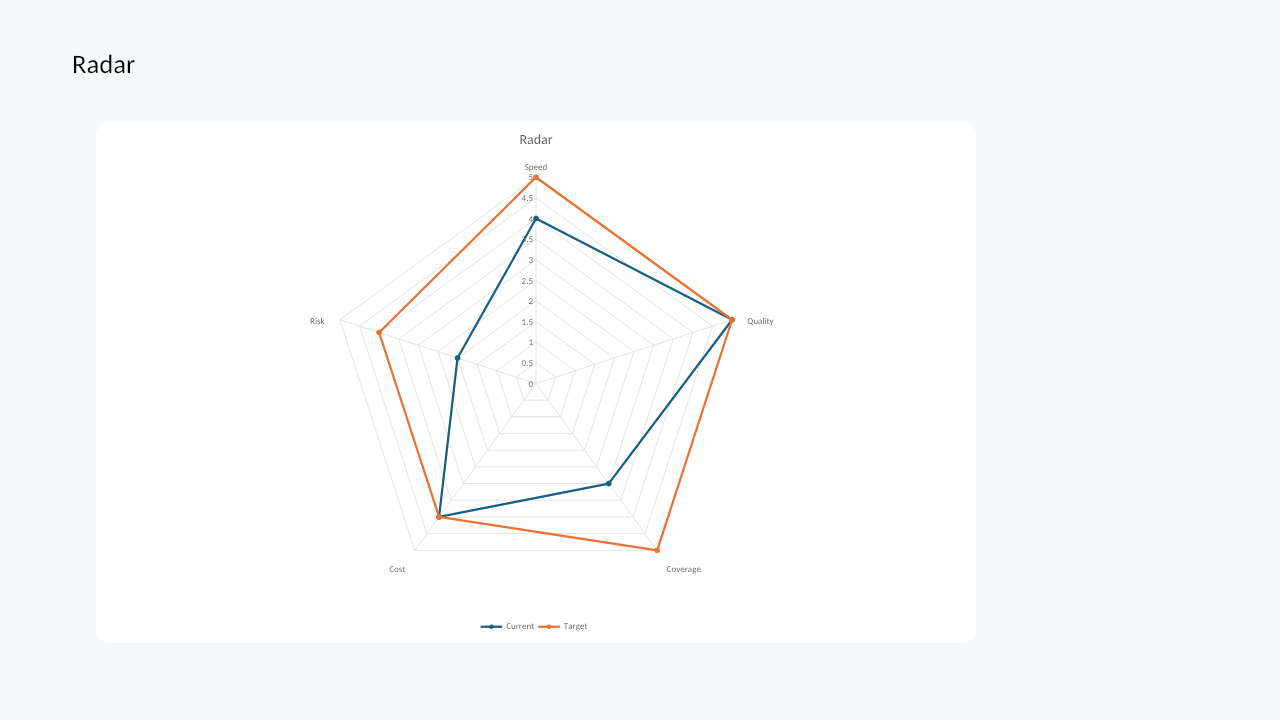
|
Radar markers and multiple series |
| Surface |
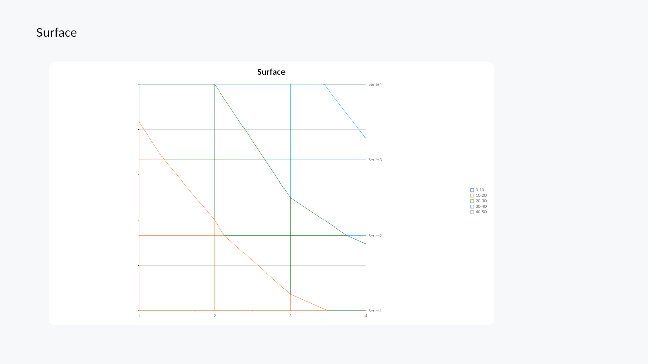
|
Top-view surface wireframe |
| Stock |
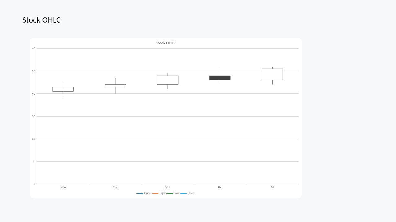
|
OHLC stock data and axes |
| Waterfall |
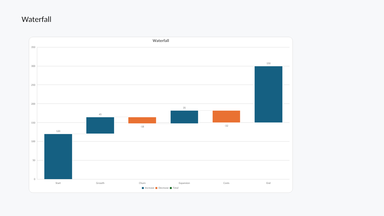
|
Positive/negative steps and connector lines |
| Histogram |
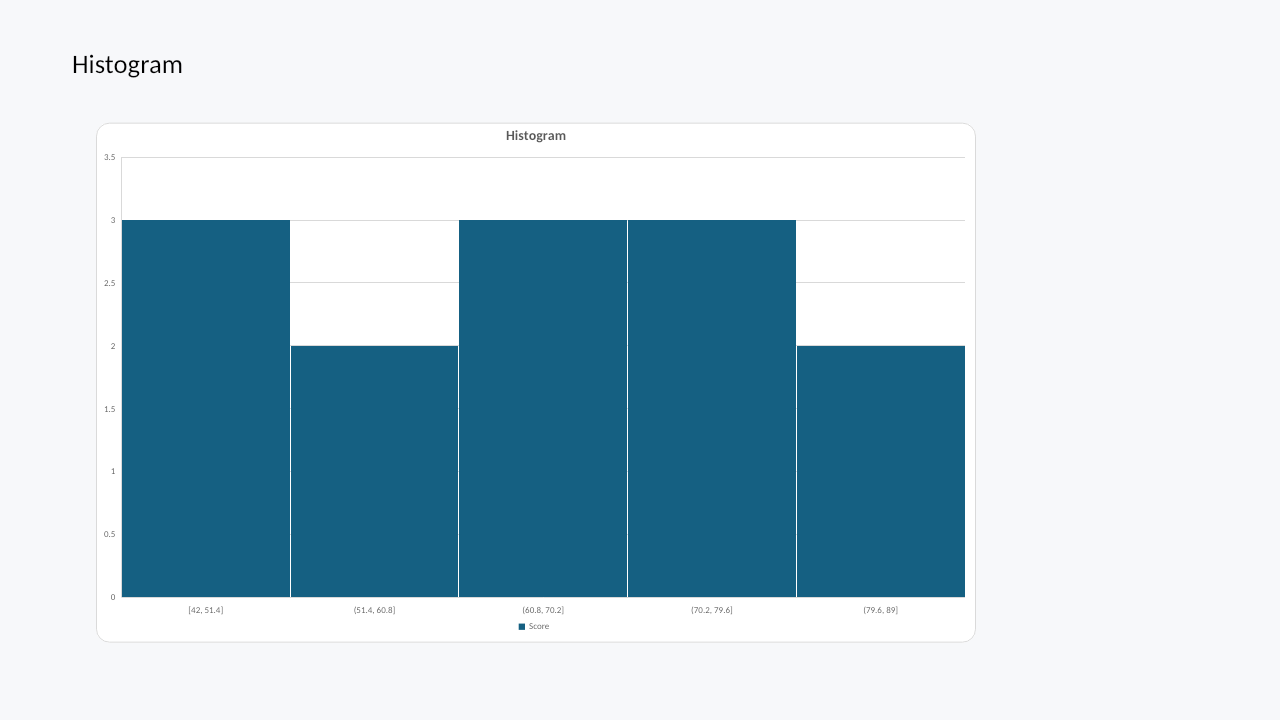
|
Histogram bins and count axis |
| Pareto |
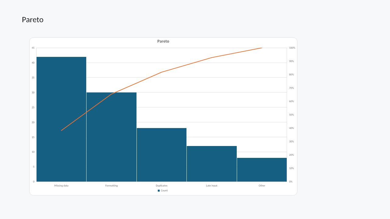
|
Sorted bars and cumulative line |
| Funnel |
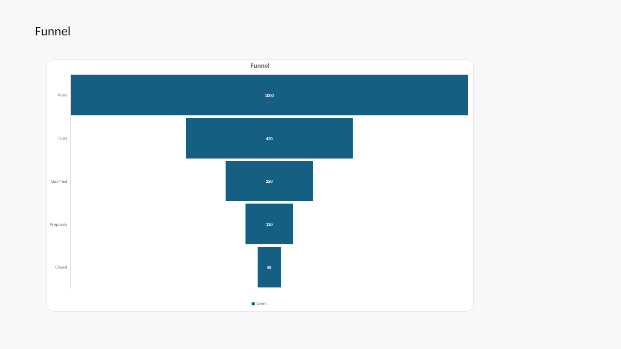
|
Funnel stages and labels |
| Box and whisker |
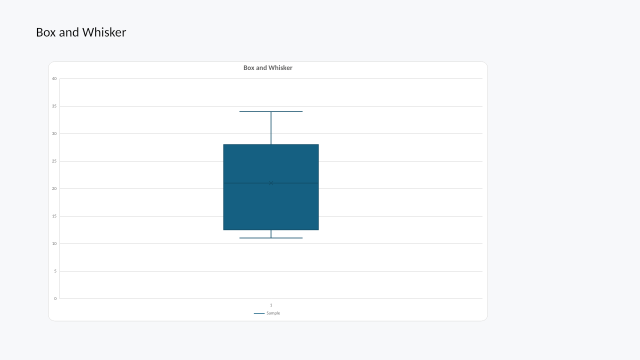
|
Quartiles, whiskers, mean markers |
| Combo |
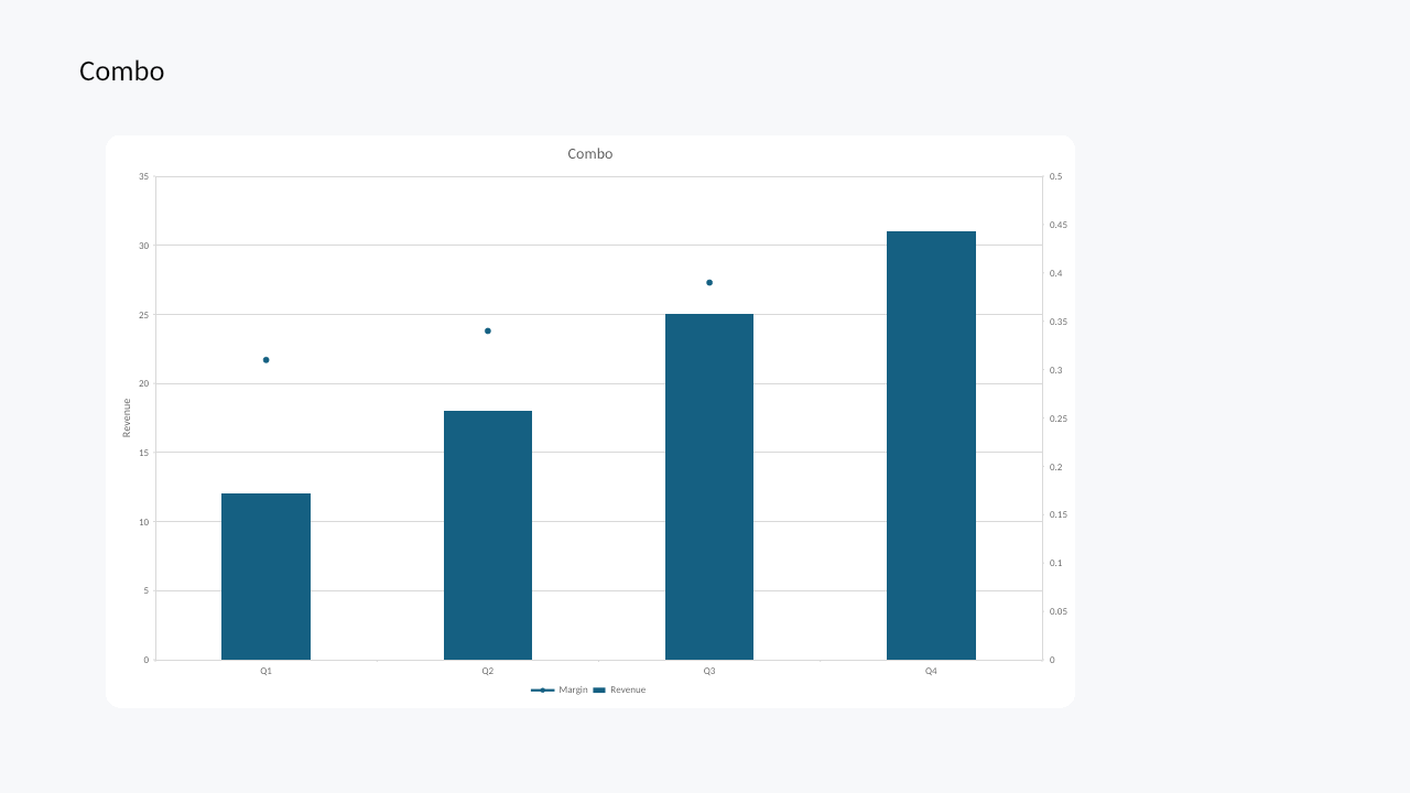
|
Column and line series with secondary axis |
Verification
After chart authoring or mutation, render the affected slide:
witan pptx render deck.pptx --slide 1 -o chart-slide.png
For regression checks:
witan pptx render deck.pptx --slide 1 -o before.png
# ... edit chart ...
witan pptx render deck.pptx --slide 1 --diff before.png -o diff.png
Implementation note
The PPTX chart API depends on Witan's shared chart engine. The presentation runtime uses PowerPoint chart parts and embedded chart workbooks, while the chart model and rendering code share core behavior with Spreadsheets.